Tech giant Microsoft has leveraged Android 12L’s advanced theming system to make the interface look more like the Fluent UI that is used on Windows 11.
As per ANI, the notification shade, a settings screen, and activity feed in the Microsoft launcher has been restyled to look like their Windows counterparts.
This means that icons, colours, and UI controls have been unified with the Windows style. Many areas of the interface also feature blur, which is also part of the Windows design language.
The new software includes the wallpapers that are available on Windows and brings matching accent color options to complete the look.
Further, the Surface Slim Pen 2 now has similar functionality as on Surface PCs – you can tap the button on top to reveal a quick launch bar with shortcuts for relevant apps.
Microsoft Teams got a couple of upgrades too as users can now transfer a Teams meeting through the Time widget, also performance and battery usage were improved by offloading the heavy lifting to hardware acceleration.
Additionally, the new conversations widgets let you put specific chats on the home screen. Another new widget shows photos from OneDrive.
 Vaz, Mani, Gupta to head 3 verticals of RIL-Disney India merged entity
 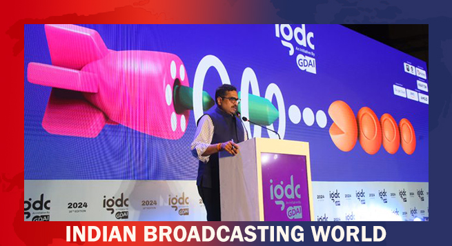 Govt & industry to prime gaming space for global dominance: MIB Secy Jaju
  Netflix ad-supported tier touches 70mn MAUs globally
  Minister Murugan likens IFFI to Cannes fest; ‘Better Man’ opening film
  Nickelodeon extends #HappyKidding campaign
 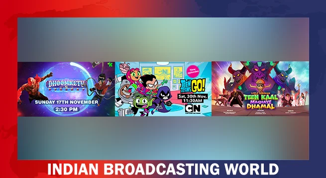 WBD celebrates kids with enchanting lineup
 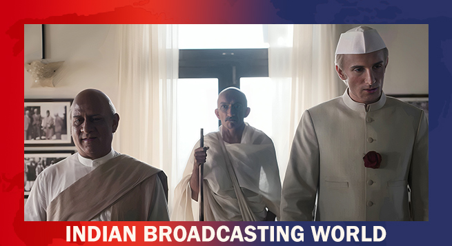 Nikkhil Advani: SonyLIV’s ‘Freedom at Midnight’ chronicles Indian history
  TRAI deadline for submission on ground-based b’casters extended
  Prime Video to premiere ‘Rana Daggubati Show’ Nov 23


