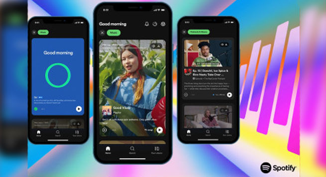
Spotify is redesigning its home screen to make it more user-friendly. The new design will feature heavy imagery and vertical scrolling, similar to TikTok and Instagram.
The new design will be consistent with the audio streamer’s increased emphasis on diversification, including podcasts, live audio, audiobooks, live audio, and more, all to be more than just a music app.
“With this new experience, we’re giving fans an even more active role in the audio discovery process, and giving creators even more space to share their work. The new interface, which is powered by advanced recommendations, new visual canvases, and a completely new and interactive design, makes discovering new audio easier than ever before and helps introduce users to their next favorite artist, podcast, or book. It’s all about bridging the gap between creators and fans—and laying the groundwork for long-term, lasting connections that go beyond viral success.
“As the platform grows and evolves, the streamer wants to ensure that its user interface evolves as well to meet the changing needs of its users,” the streamer said during the second edition of the Stream On event.
The new interface, powered by advanced recommendations, new visual canvases, and a completely new and interactive design, makes discovering new audio easier than ever before and helps introduce users to their next favorite artist, podcast, or book, according to the company.
 Prime Video to limit in India number of TV sets having access per subscription
  Delhi HC orders meta to remove deepfake videos of Rajat Sharma
  Govt. blocked 18 OTT platforms for obscene content in 2024
  Broadcasting industry resists inclusion under Telecom Act
  DTH viewing going down & a hybrid ecosystem evolving: Dish TV CEO
  Abhishek Singh Rajput shines in ‘Swipe Crime’ on MX Player
  Farhan Akhtar’s ‘120 Bahadur’ to hit theatres on November 21, 2025
  COLORS announces 2025 lineup
  Sony YAY! announces holiday wishes from Toon-Town this Christmas
  8Bit Creatives partners with ESFI to elevate WAVES esports championship 2025


