Google-owned streaming platform YouTube is rolling out a new video page that tweaks several elements and, most notably, unifies the design across Android, iOS, and the web.
The highlight of this redesign is the use of pill-shaped buttons for key elements. For example, instead of being two distinct buttons, thumbs up/down and the like count are housed in one container.
Share, Create (Shorts), Download, and other things users frequently interact with get the same treatment, the report said.
Meanwhile, that carousel (on mobile) is now underneath channel details, with that information coming after the video title, view count, publish date, and hashtags, IANS reported.
This new design might also coincide with ‘Ambient Mode’, which allows the bottom of a video to bleed into the description section and system status bar for a more immersive experience.
However, this can be optionally enabled/disabled from the overflow menu.
Another key change with this revamps places the top comment in a more prominent container that stands out on the screen. This technique might ultimately prove successful in getting people to engage more.
Things are slightly different on the desktop, with the video description getting the visual call out, something that Creators should benefit from, as per the report.
This revamp has been slowly appearing for more users in recent weeks but is not yet widely rolled out.
 PM Modi releases stamps honouring Guru Dutt, Bhanumathi, other cinema icons at WAVES
  India at dawn of Orange Economy, says PM Modi at WAVES
 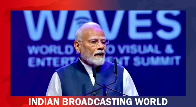 ‘Right Time for Create in India, Create for the World,’ says PM Modi at WAVES
  WAVES 2025 to set sail in Mumbai today, promises to transform India’s creative economy
  Sony MAX 1 set to launch on May 1
  Zee Tamil unveils special ‘Game Changer’ content line-up to mark May Day
  Aanand L. Rai, Hemant Dhome team up again for ‘Krantijyoti Vidyalay – Marathi Madhyam’
  Karan Tacker wraps up shoot for ‘Bhay’ in London
  Instagram accounts of Mahira Khan, Hania Aamir, Ali Zafar blocked in India


